Ocycle
Ocycle
Visual identity
Mobile app
Role: Brand strategy ~ Visual identity ~ Digital experience
Role: Product design ~ UX thinking ~ Visual identity
Role: Product design ~ UX thinking ~ Visual identity
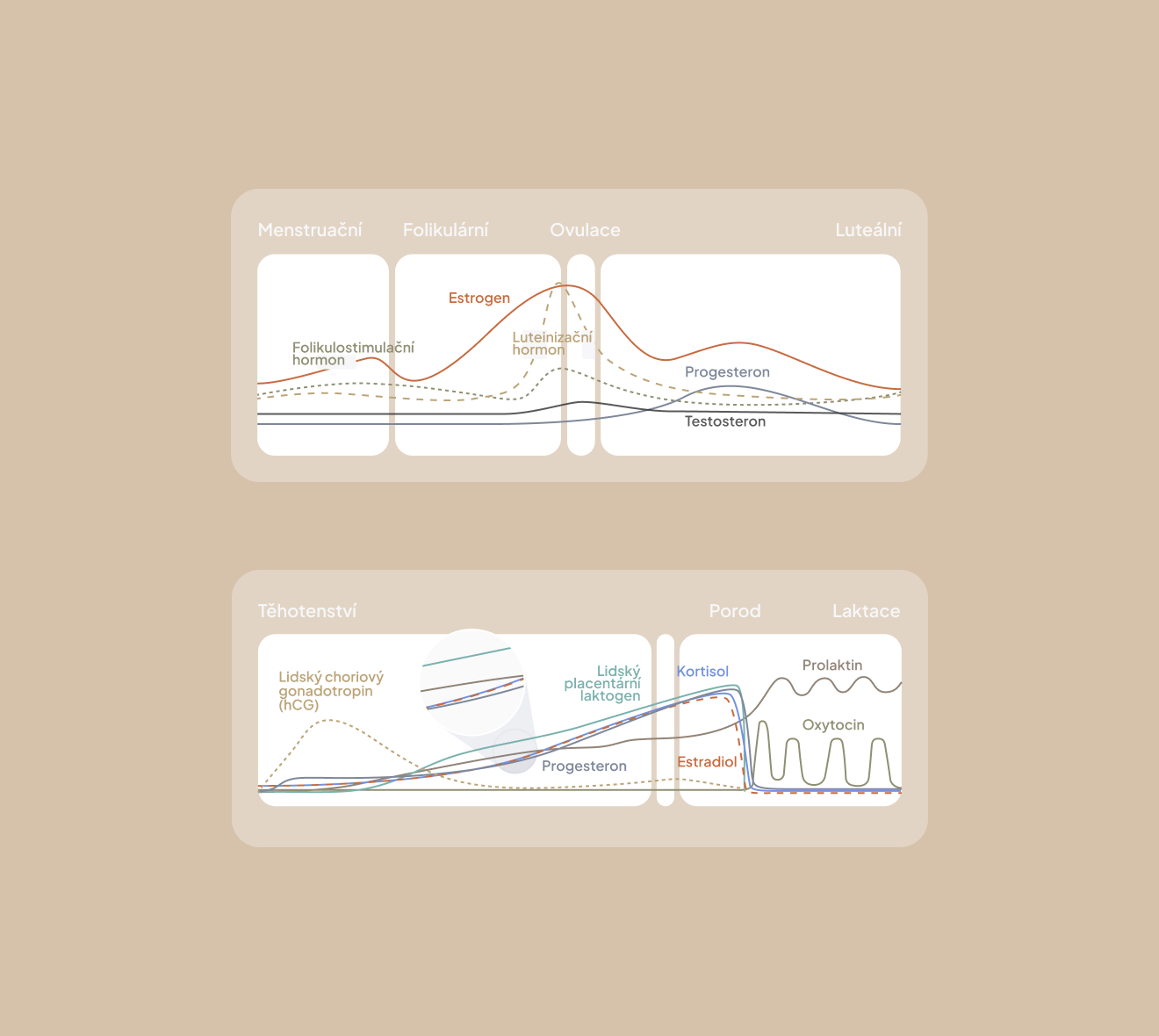
The visual identity for Ocycle was created to support a brand that helps women understand their bodies with clarity and confidence. It was designed to reflect expertise without feeling clinical, and to communicate important information in a way that is approachable, trustworthy, and visually calm. The identity strengthens the brand’s mission to guide women through their cycle with clarity, ease, and everyday usability.
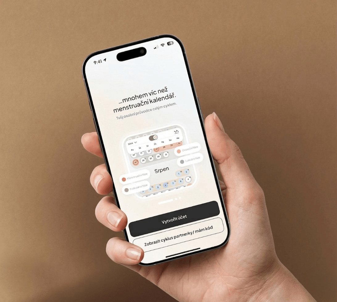
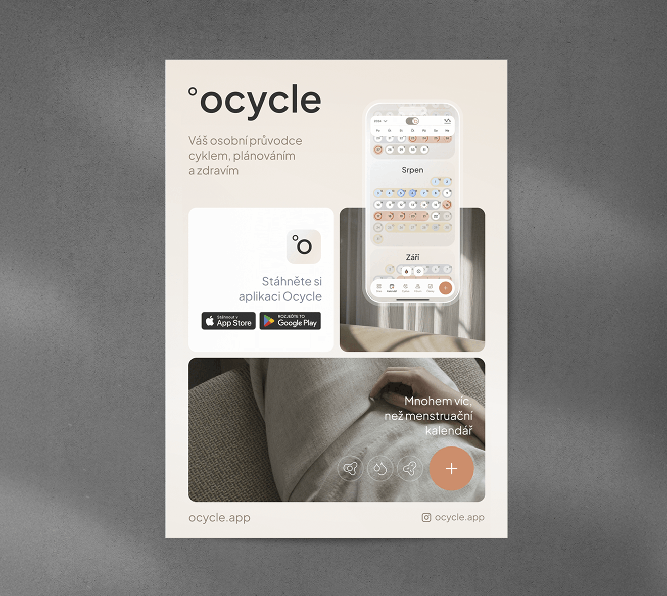
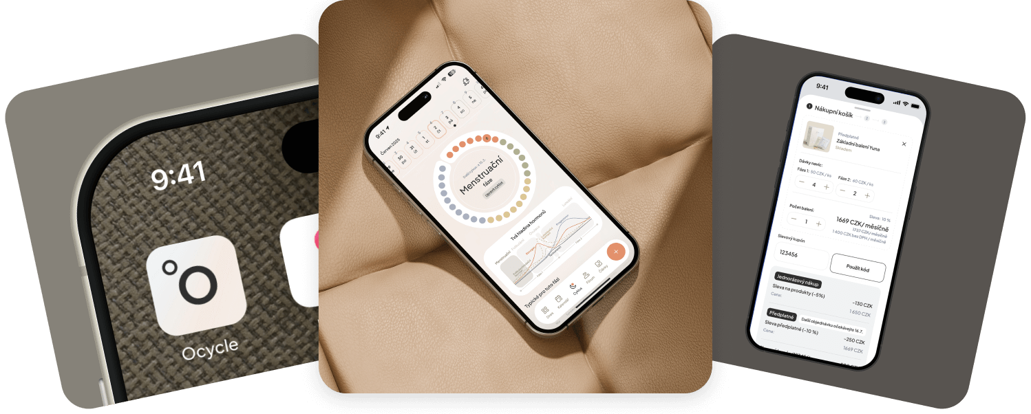
The mobile app Ocycle for tracking the female cycle is designed for women who don’t want to rely only on internet advice or solely on their gynecologist. By tracking their cycle, they know what’s happening with their bodies on a daily basis and are able to find solutions quickly.

Brand context
Problem:
Creating the visual identity meant defining a system that feels professional, modern, and quietly confident.
Goal:
In a category often dominated by overly medical or overly playful design, the goal was to establish a balanced visual language that communicates care, clarity, and trust.
Problem & Goal
Problem
Users often feel uncomfortable using intimate health applications in public or shared spaces.
Goal
Achieve a discreet design users feel comfortable opening even in public.
Problem & Goal
Problem:
TUsers often feel uncomfortable using intimate health applications in public or shared spaces.
Goal:
Achieve a discreet design users feel comfortable opening even in public.
Problem & Goal
Problem:
TUsers often feel uncomfortable using intimate health applications in public or shared spaces.
Goal:
Achieve a discreet design users feel comfortable opening even in public.
The result is a cohesive system that strengthens the brand and ensures consistency across all touchpoints.
The result is an application that helps women better understand their own bodies.

Three core design principles
Subtle color gradients were applied as backgrounds, further softening the interface and enhancing its feminine style.
• Discretion ~ visual calmness and subtle interaction
• Clarity ~ intuitive communication of information
• Warmth ~ a human and approachable tone
The final color palette was refined to evoke a sense of calm and trust.
These principles helped shape the visual system across product interfaces and brand communication.
Subtle color gradients were applied as backgrounds, further softening the interface and enhancing its feminine style.


Logo & symbol
The primary wordmark combines elegance with simplicity to ensure strong recognition while maintaining a calm presence.
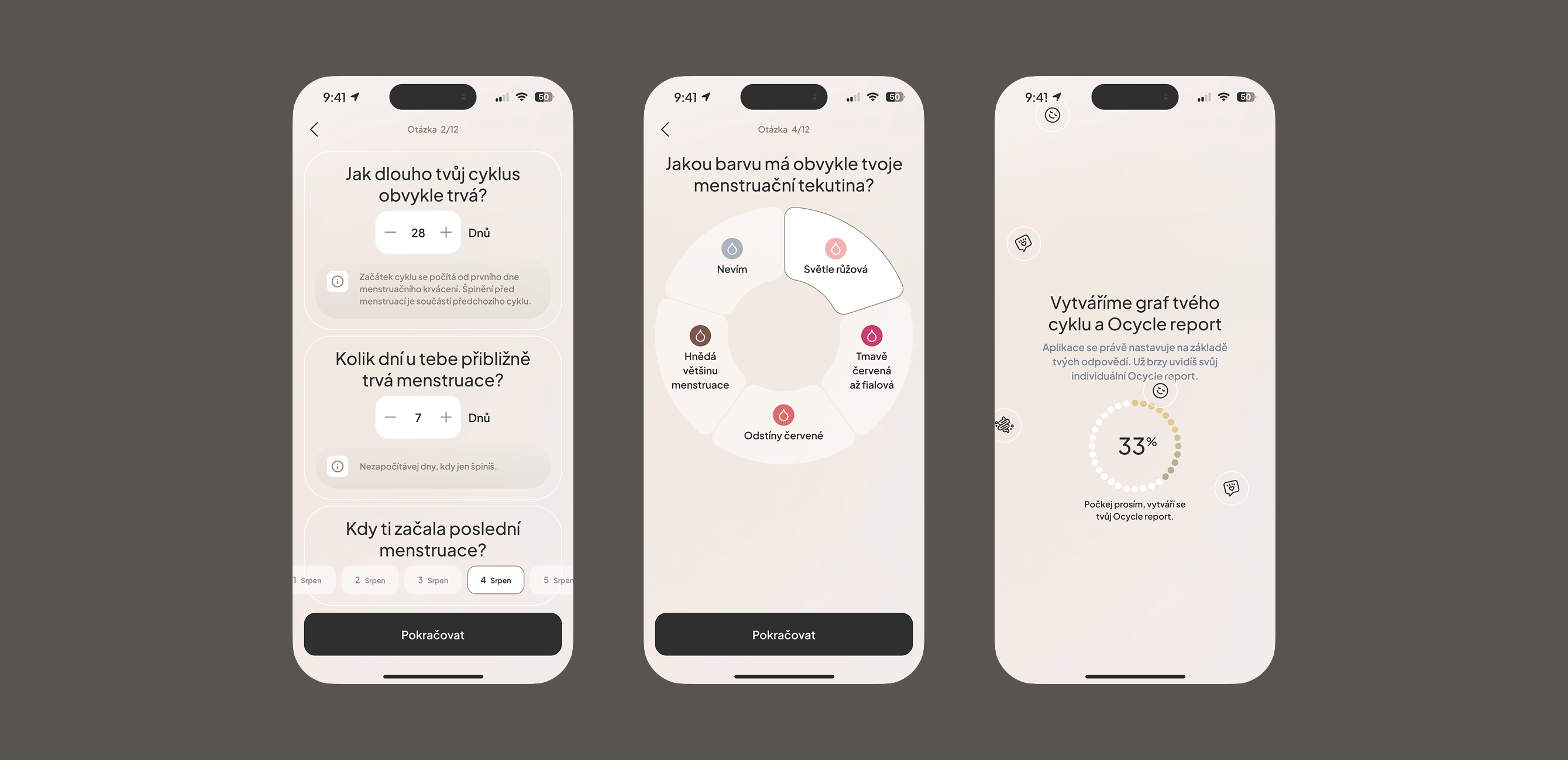
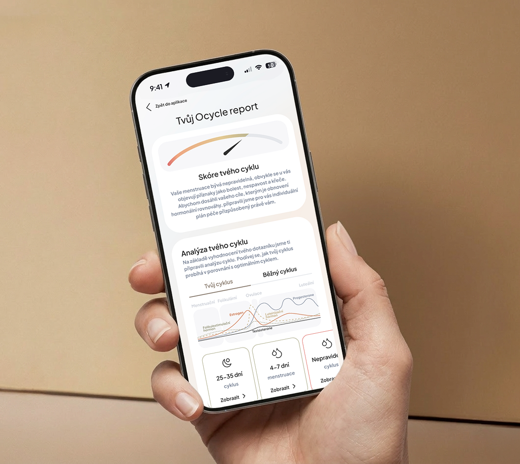
I incorporated subtle elements and symbols into the interface to help users navigate easily.
I incorporated subtle elements and symbols into the interface to help users navigate easily.
Interpretation of colors, typography, and visual tone (not descriptive, but strategic).
A subtle symbol derived from circular forms references rhythm, balance, and continuity — reflecting the cyclical nature of the product.
Warm neutral tones and soft contrasts were selected to create a sense of safety and familiarity.
The mark remains versatile across digital platforms while supporting a discreet brand presence.
Typography and spacing support clarity without feeling clinical or overwhelming.

Visual language
The visual system was designed to feel soft, balanced, and emotionally reassuring.
Subtle cues supporting intuitive use.
Subtle cues supporting intuitive use.
Subtle cues supporting intuitive use.

Color palette
The color palette was designed to evoke softness, calm, and balance.
Calm presentation without overload.
Calm presentation without overload.
Calm presentation without overload.
Warm neutral tones create emotional comfort, while gentle gradients introduce depth and a feminine character to the overall look.
Warm neutral tones and soft contrasts were selected to create a sense of safety and familiarity.
This approach allows the brand to feel both educational and emotionally supportive.
Typography and spacing support clarity without feeling clinical or overwhelming.

Typography
A clean typographic structure was established to support readability while reinforcing the brand's professional tone.
Discreet interaction even in public spaces.
Discreet interaction even in public spaces.
Discreet interaction even in public spaces.


Brand system
Warm neutral tones and soft contrasts were selected to create a sense of safety and familiarity.
The visual system was designed as a flexible framework that supports both product design and brand communication.
Warm neutral tones and soft contrasts were selected to create a sense of safety and familiarity.
From interface components to educational content, each element contributes to a consistent and recognisable visual identity.
Typography and spacing support clarity without feeling clinical or overwhelming.
Product integration
The identity naturally extends into the mobile experience, ensuring that visual language, typography, and color remain consistent across the product.
The application comes across as modern, educational, and gently feminine.
The application comes
across as modern, educational,
and gently feminine.
The application comes across as modern, educational, and gently feminine.
This integration strengthens brand recognition while maintaining a calm and intuitive user experience.
The application comes across as modern, educational, and gently feminine.
The application comes
across as modern, educational,
and gently feminine.
The application comes across as modern, educational, and gently feminine.
Brand applications
The visual identity was extended across web interfaces, product presentation, and marketing materials.
The application comes across as modern, educational, and gently feminine.
The application comes
across as modern, educational,
and gently feminine.
The application comes across as modern, educational, and gently feminine.

Outcome
Subtle color gradients were applied as backgrounds, further softening the interface and enhancing its feminine style.
The resulting identity positions Ocycle as a modern, educational, and gently feminine brand within the intimate health space.
The final color palette was refined to evoke a sense of calm and trust.
By prioritising clarity, discretion, and emotional warmth, the visual system supports both product usability and long-term brand recognition.
Subtle color gradients were applied as backgrounds, further softening the interface and enhancing its feminine style.


A few words from our client
A few words from our client
“
“
“
Alena was the first designer who managed to turn my ideas into reality. She has an incredible ability to truly understand a client’s needs, tune into your vision, and give it the professional look you expect. We worked together for over two years, and thanks to her, the timeless app for women, Ocycle, was created. I believe this project also resonated with her artistic heart, allowing her to fully express herself and bring something genuinely new into the world. Alena and I became so well aligned in design, and she understands the style of my brands so well, that we continue to collaborate. I’m excited to see what new look she will give to my future projects as well.
Alena was the first designer who managed to turn my ideas into reality. She has an incredible ability to truly understand a client’s needs, tune into your vision, and give it the professional look you expect. We worked together for over two years, and thanks to her, the timeless app for women, Ocycle, was created. I believe this project also resonated with her artistic heart, allowing her to fully express herself and bring something genuinely new into the world. Alena and I became so well aligned in design, and she understands the style of my brands so well, that we continue to collaborate. I’m excited to see what new look she will give to my future projects as well.
Katarína Miroš Baniari
Founder & CEO
Bagniaristore, Ocycle
Katarína Miroš Baniari
Founder & CEO
Bagniaristore, Ocycle
Project summary
Project summary
Role:
Brand identity designer
Role:
Product & UI Designer
Focus:
Intimate health brand
Focus:
Discreet mobile experience
Outcome:
Visual identity, design system and digital brand applications
Outcome:
Calm, emotionally safe interface for intimate health tracking
Interested in a similar approach for your product or brand? Let’s connect.
Interested in a similar approach for your product or brand? Let’s connect.
Next project

Alena Janíčková
aj studio © 2026
Alena Janíčková
aj studio © 2026
Prague based
Czech Republic
Prague based
Czech Republic
Prague based
Czech Republic