Yuna
Yuna
Packaging design
Packaging design
Packaging design
Packaging design
Role: Packaging design ~ Brand system ~ Product design
Role: Packaging design ~ Brand system ~ Product design
Role: Packaging design ~ Brand system ~ Product design
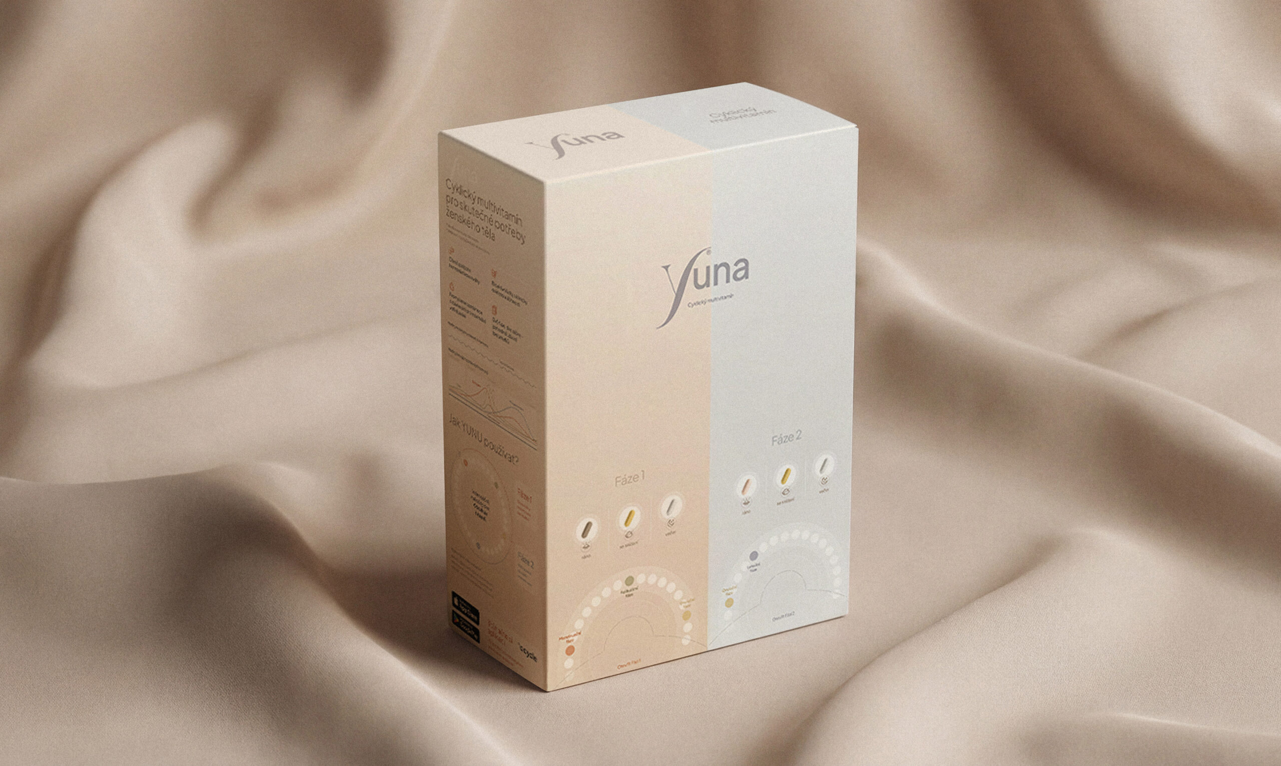
The packaging design for YUNA was created to support a brand focused on women’s cycle health and fertility. Building on the visual language of Ocycle, the design translates softness, clarity, and expertise into a tangible product. The goal was to create packaging that feels trustworthy, calm, and feminine, while clearly communicating the concept of cyclical vitamins and everyday care.
The packaging design for YUNA was created to support a brand focused on women’s cycle health and fertility. Building on the visual language of Ocycle, the design translates softness, clarity, and expertise into a tangible product. The goal was to create packaging that feels trustworthy, calm, and feminine, while clearly communicating the concept of cyclical vitamins and everyday care.
Problem & Goal
Problem:
The Yuna supplement already existed as multiple bottles with different vitamins. Users had to remember what to take and when during the cycle, making the routine unnecessarily complex.
Goal:
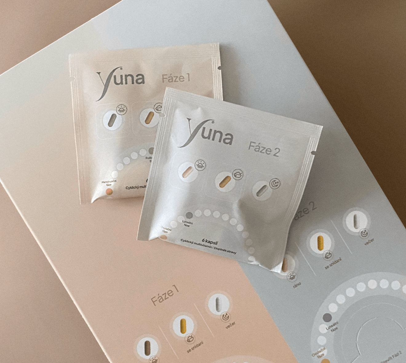
Simplify the product into a clear two-phase cycle system. Each phase is represented by a dedicated sachet containing the precise daily dose of supplements - turning a complex routine into an intuitive daily habit.
Problem & Goal
Problem
The Yuna supplement already existed as multiple bottles with different vitamins. Users had to remember what to take and when during the cycle, making the routine unnecessarily complex.
Goal
Simplify the product into a clear two-phase cycle system. Each phase is represented by a dedicated sachet containing the precise daily dose of supplements - turning a complex routine into an intuitive daily habit.
Problem & Goal
Problem:
The Yuna supplement already existed as multiple bottles with different vitamins. Users had to remember what to take and when during the cycle, making the routine unnecessarily complex.
Goal:
Simplify the product into a clear two-phase cycle system. Each phase is represented by a dedicated sachet containing the precise daily dose of supplements - turning a complex routine into an intuitive daily habit.
Designing a calm and trustworthy packaging system for cycle-support supplements.
Designing a calm and trustworthy packaging system for cycle-support supplements.

Brand approach
Brand approach
The packaging design was built as a natural extension of the Ocycle visual identity. Rather than focusing on visual impact alone, the goal was to create a calm and supportive product presence that communicates clarity and care.
The packaging design was built as a natural extension of the Ocycle visual identity. Rather than focusing on visual impact alone, the goal was to create a calm and supportive product presence that communicates clarity and care.
The design balances minimalism with warmth, allowing the product to feel both professional and approachable.
The design balances minimalism with warmth, allowing the product to feel both professional and approachable.
Brand principles
Brand principles
• Clarity over complexity
• Calm over clinical appearance
• Brand and product consistency
• Clarity over complexity
• Calm over clinical appearance
• Brand and product consistency

Visual language
The packaging follows the calm visual language of the Ocycle brand.
The packaging follows the calm visual language of the Ocycle brand.
The packaging follows the calm visual language of the Ocycle brand.
The packaging follows the calm visual language of the Ocycle brand.
The packaging follows the calm visual language of the Ocycle brand.
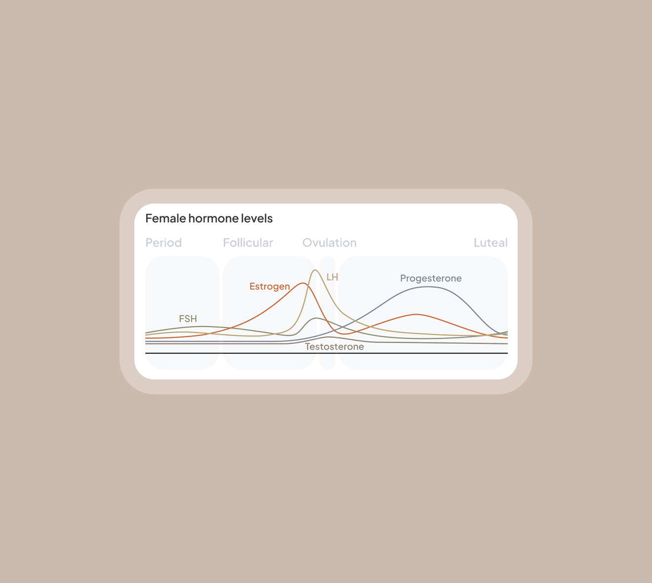
Warm neutral tones and subtle gradients maintain the soft and balanced character of the Ocycle brand.
Warm neutral tones and subtle gradients maintain the soft and balanced character of the Ocycle brand.
Warm neutral tones and subtle gradients maintain the soft and balanced character of the Ocycle brand.
Warm neutral tones and subtle gradients maintain the soft and balanced character of the Ocycle brand.
Clean typography and generous spacing support clarity while reinforcing the product’s sense of trust and professionalism.
Clean typography and generous spacing support clarity while reinforcing the product’s sense of trust and professionalism.
Clean typography and generous spacing support clarity while reinforcing the product’s sense of trust and professionalism.
Clean typography and generous spacing support clarity while reinforcing the product’s sense of trust and professionalism.
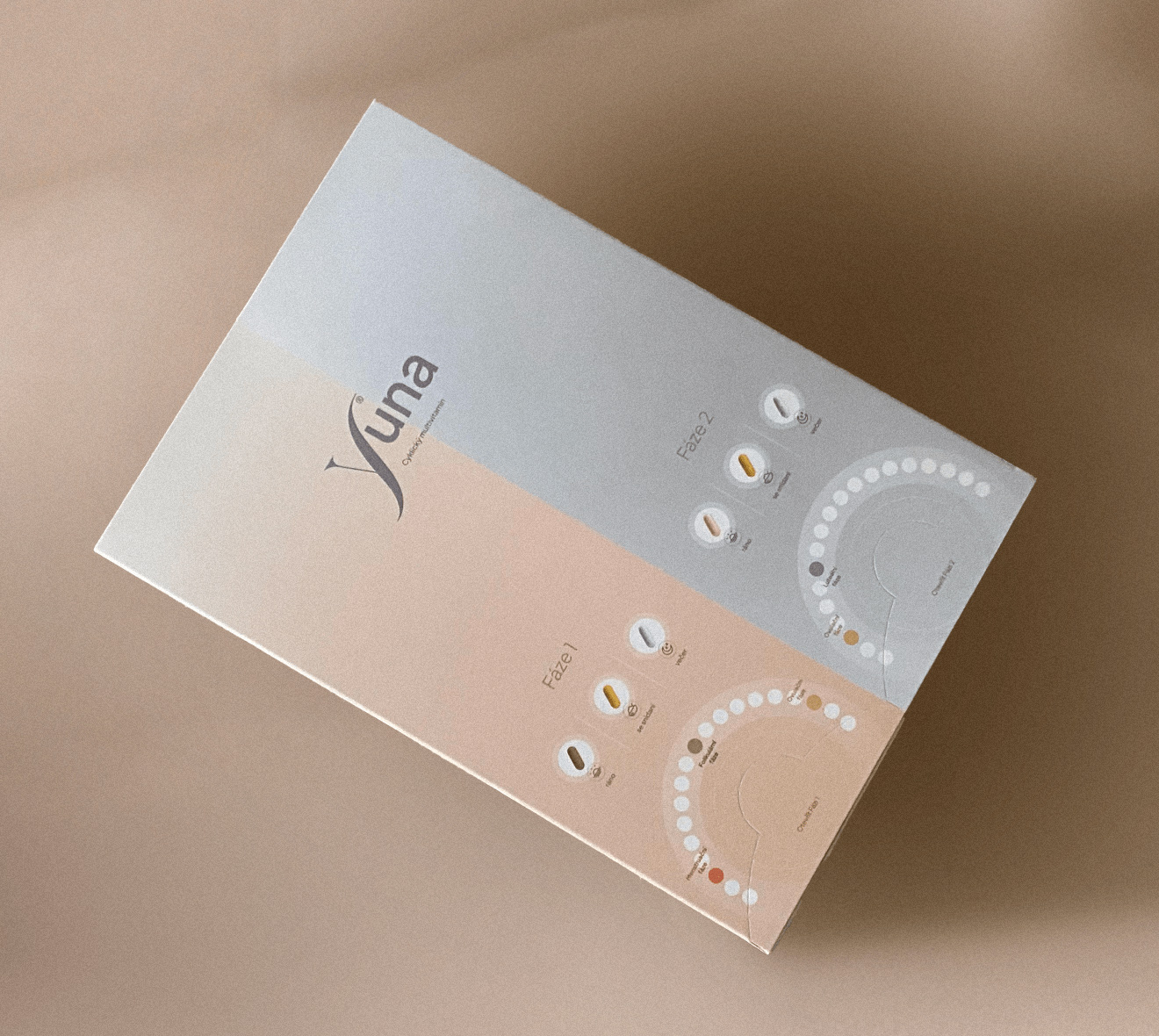
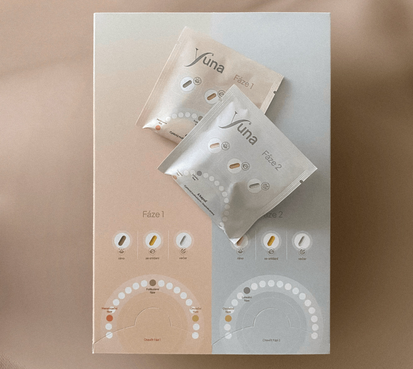
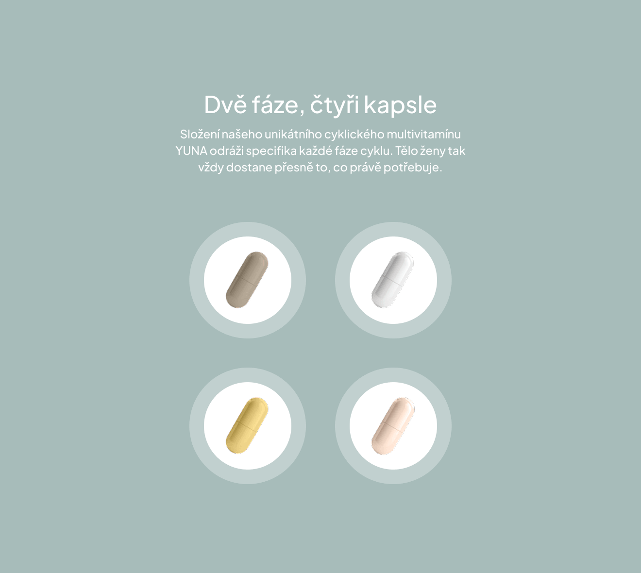
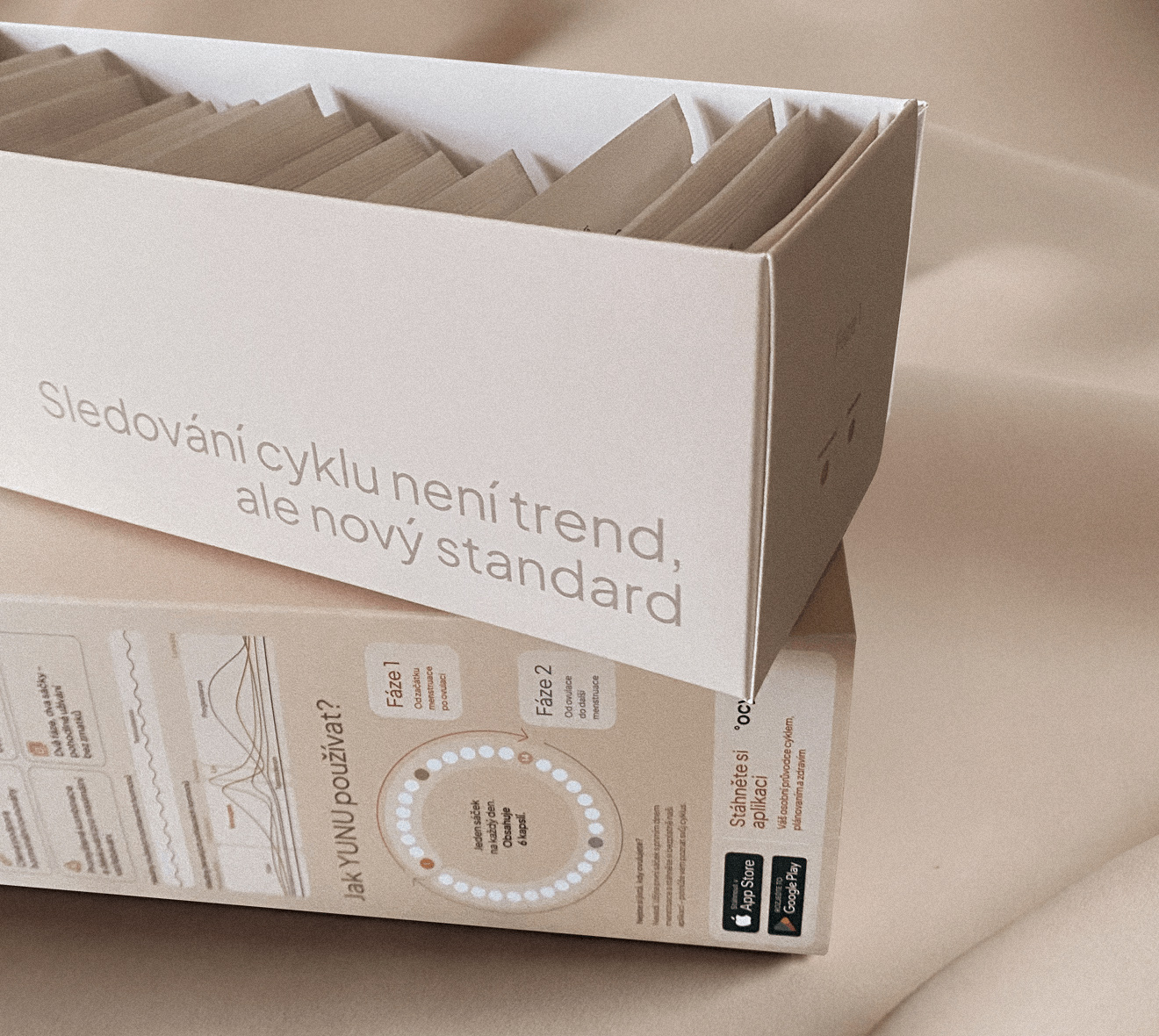
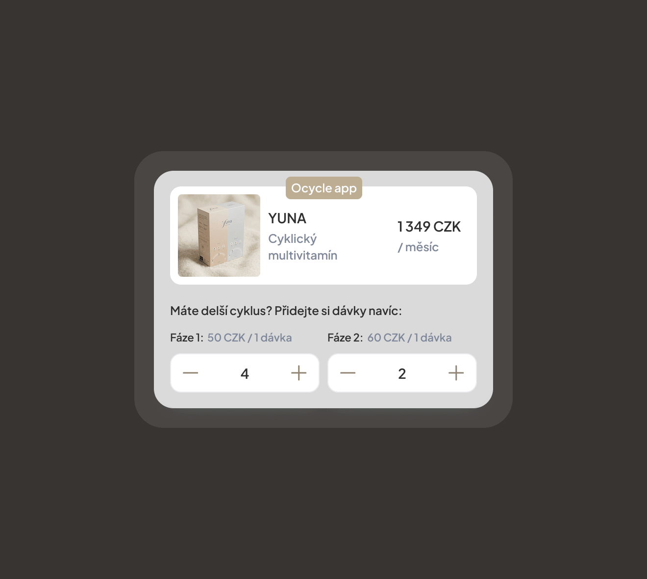
Product structure
A cohesive system connecting the outer box and individual sachets.
A cohesive system connecting the outer box and individual sachets.
A cohesive system connecting the outer box and individual sachets.
A cohesive system connecting the outer box and individual sachets.
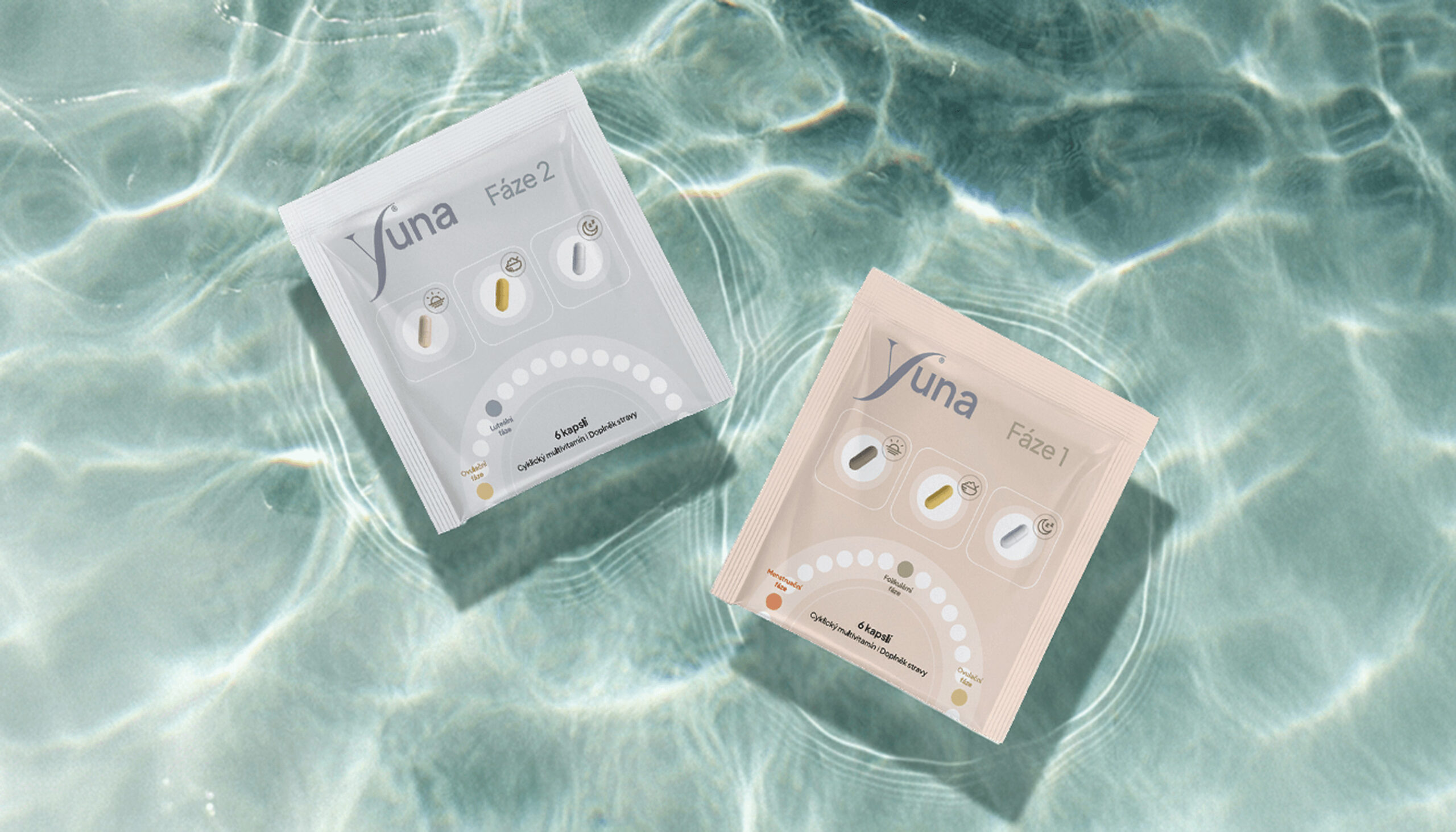
Information hierarchy
Clear layouts help users easily understand dosage and product usage.
Clear layouts help users easily understand dosage and product usage.
Clear layouts help users easily understand dosage and product usage.
Clear layouts help users easily understand dosage and product usage.
Product experience
The packaging was designed to feel calm, simple, and intuitive during everyday use.
The packaging was designed to feel calm, simple, and intuitive during everyday use.
The packaging was designed to feel calm, simple, and intuitive during everyday use.
The packaging was designed to feel calm, simple, and intuitive during everyday use.
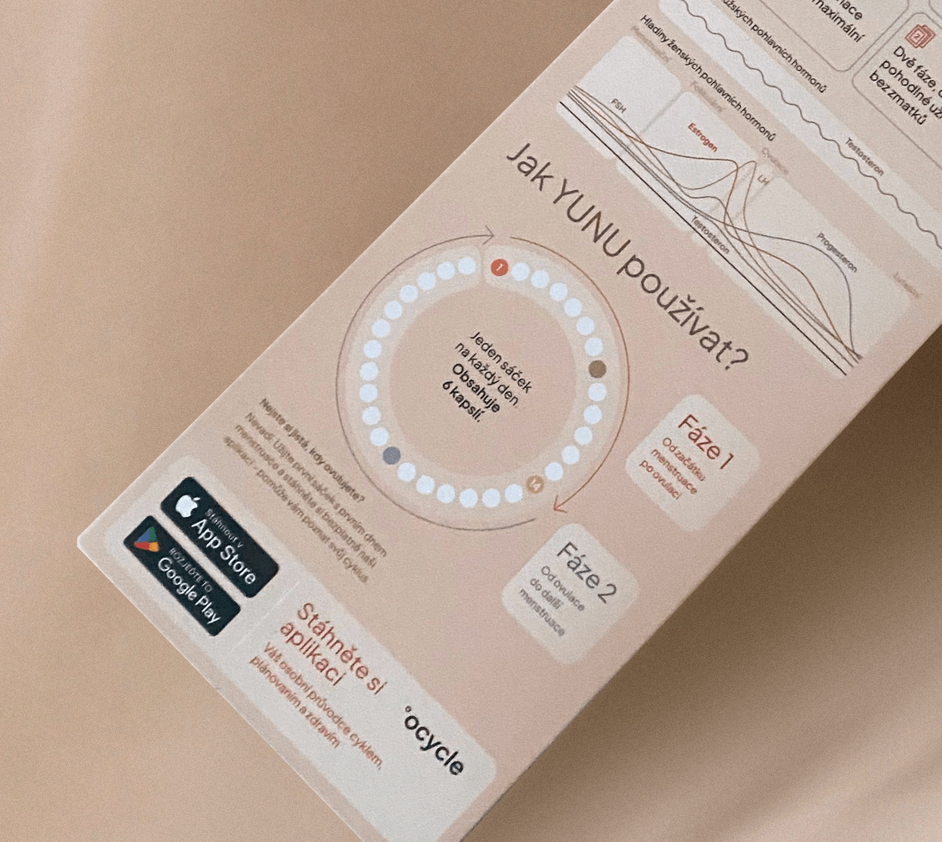

Microinteractions
Microinteractions
Subtle details, iconography, and clean typography guide the user through the product.
Subtle details, iconography, and clean typography guide the user through the product.
These elements also reinforce a sense of reliability and care.
These elements also reinforce a sense of reliability and care.
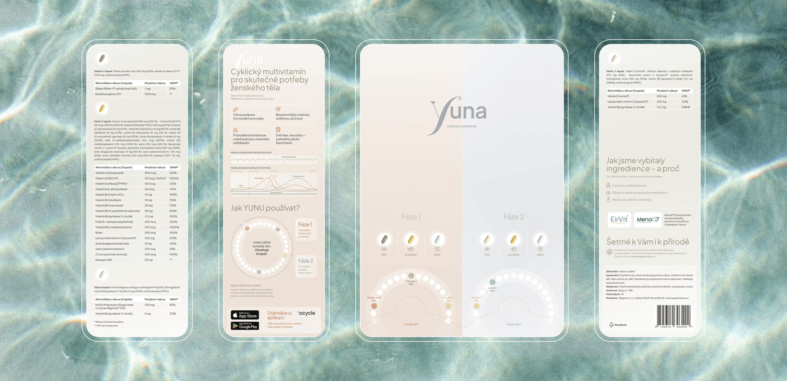
Visual elements
The layout and visual elements were carefully composed to highlight clarity and elegance.
The layout and visual elements were carefully composed to highlight clarity and elegance.
The layout and visual elements were carefully composed to highlight clarity and elegance.
The layout and visual elements were carefully composed to highlight clarity and elegance.

A few words from our client
A few words from our client
“
“
“
Alena was the first designer who managed to turn my ideas into reality. She has an incredible ability to truly understand a client’s needs, tune into your vision, and give it the professional look you expect. We worked together for over two years, and thanks to her, the timeless app for women, Ocycle, was created. I believe this project also resonated with her artistic heart, allowing her to fully express herself and bring something genuinely new into the world. Alena and I became so well aligned in design, and she understands the style of my brands so well, that we continue to collaborate. I’m excited to see what new look she will give to my future projects as well.
Alena was the first designer who managed to turn my ideas into reality. She has an incredible ability to truly understand a client’s needs, tune into your vision, and give it the professional look you expect. We worked together for over two years, and thanks to her, the timeless app for women, Ocycle, was created. I believe this project also resonated with her artistic heart, allowing her to fully express herself and bring something genuinely new into the world. Alena and I became so well aligned in design, and she understands the style of my brands so well, that we continue to collaborate. I’m excited to see what new look she will give to my future projects as well.
Katarína Miroš Baniari
Founder & CEO
Bagniaristore, Ocycle
Katarína Miroš Baniari
Founder & CEO
Bagniaristore, Ocycle
Project summary
Project summary
Role:
Packaging & Brand Designer
Role:
Packaging & Brand Designer
Focus:
Health supplement packaging system
Focus:
Health supplement packaging system
Outcome:
A calm and cohesive packaging design extending the Ocycle brand into a physical product experience
Outcome:
A calm and cohesive packaging design extending the Ocycle brand into a physical product experience
Interested in a similar approach for your product or brand? Let’s connect.
Interested in a similar approach for your product or brand? Let’s connect.

Next project
Next project

Alena Janíčková
aj studio © 2026
Alena Janíčková
aj studio © 2026
Prague based
Czech Republic
Prague based
Czech Republic
Prague based
Czech Republic